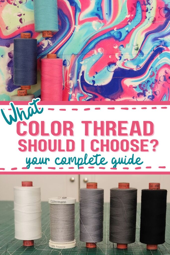
What Color Thread Should I Use? The Rules Every Sewist Should Know
True or false: you should always match your thread color exactly to your fabric?
The myth of the perfect match
We’ve all stood in the fabric shop holding a swatch up to every spool on the rack, hunting for an exact color match. It feels like the right thing to do. If the thread is the same color as the fabric, it’ll be invisible, right?
Not quite.
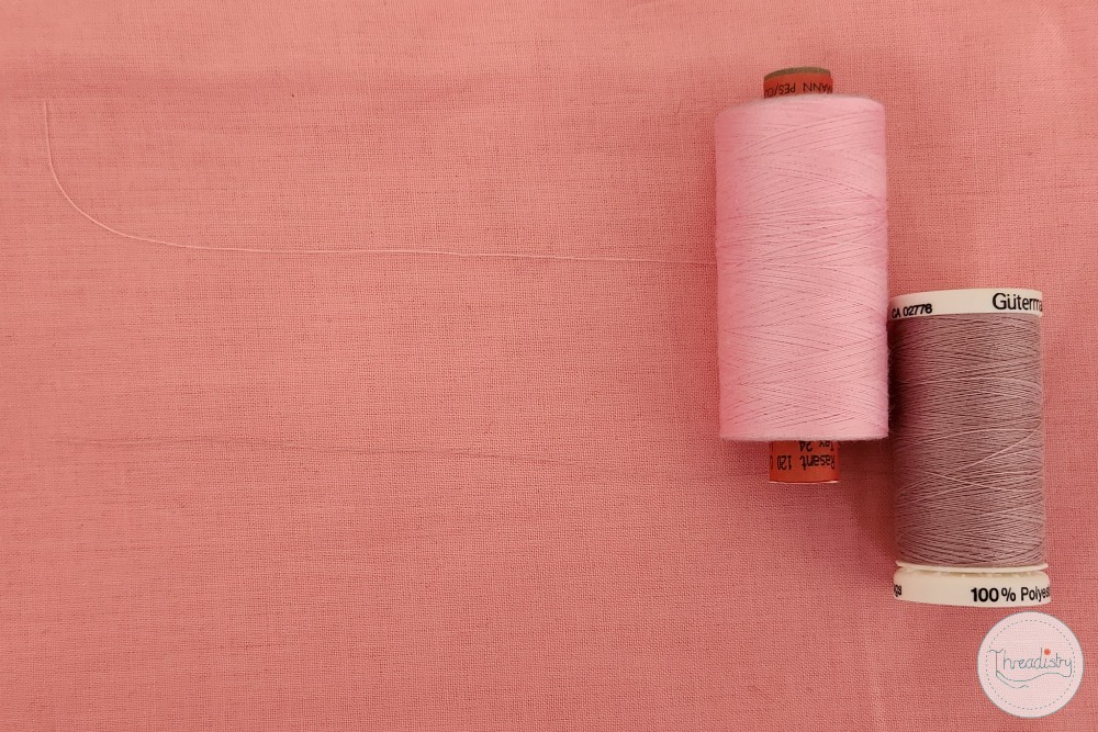
The problem is that thread sits on the surface. Even the most careful stitching has a tiny amount of texture and height. Under different lighting (natural light, overhead bulbs, the glare of a fitting room), a perfectly matched thread will catch the light differently to the fabric and stand out more than you’d expect.
Go darker, not lighter
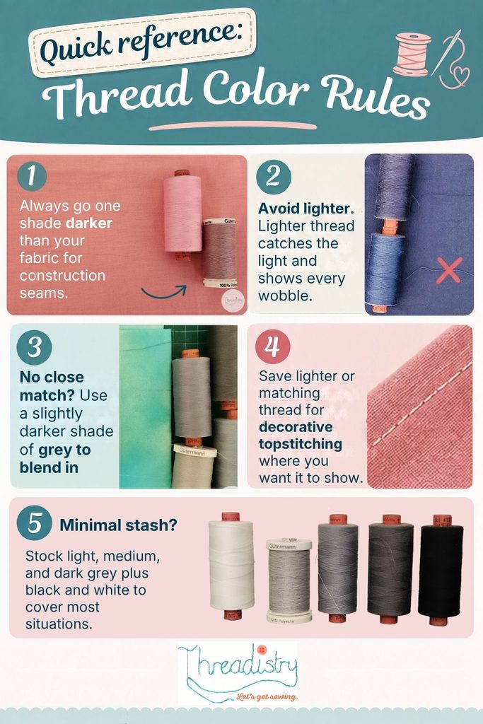
Here’s the rule professional seamstresses and tailors use: choose a thread that’s one shade darker than your fabric, never lighter.
The reason comes down to how the eye reads contrast. Darker thread visually recedes into the background and is viewed as part of the surface. Lighter thread, even by a half-shade, catches the light and draws the eye. So you see every tiny wobble, every small deviation from a perfectly straight seam. And let’s be honest: none of us sews a perfectly straight seam every single time.
Darker thread recedes. Lighter thread reveals.
What this looks like in practice
Working with a light blush pink? Reach for a dusty rose or muted mauve rather than the palest thread on the rack.
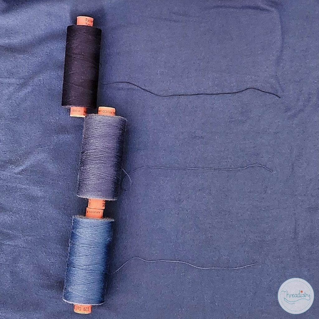
Sewing a mid-blue denim? A slightly deeper indigo thread will blend far better than a bright true blue.
With neutrals like cream or oatmeal, a warm greige or light tan will sit far more quietly on the surface than a stark white.
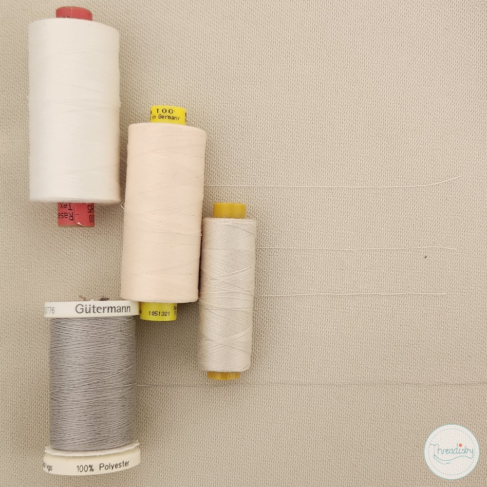
You don’t need a dramatically darker shade. We’re talking one step down the swatch card, not a full value jump. If in doubt, hold both options against the fabric and squint (or step back). The one that disappears is the right one.
Not this
Exact match or lighter
Catches the light, highlights uneven stitching, makes seams visible
Do this
One shade darker
Recedes into the weave, hides minor stitching wobbles, reads as part of the fabric
How to match thread to patterned fabric
Patterned fabrics add a layer of complexity because there’s no single color to match against. A floral might have five colors in it, a plaid eight. The good news is you don’t need to match every color. You just need to pick the right one to match against.
The general rule is to match your thread to the dominant background color of the print, then apply the darker-shade principle from there. On a navy floral with white blooms, you’re matching to the navy, not the white. On a cream print with a small scattered motif, the cream is your reference point.
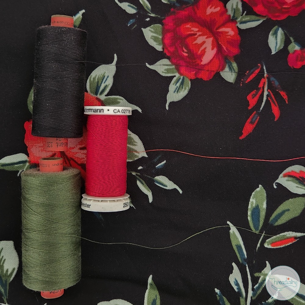
Where it gets trickier is busy prints with no clear dominant color, like an equal-weight plaid or a bold geometric. In those cases, grey thread is your best friend. A medium grey will blend in with multiple colors without fighting any of them, making it the most practical choice when no single color wins out.
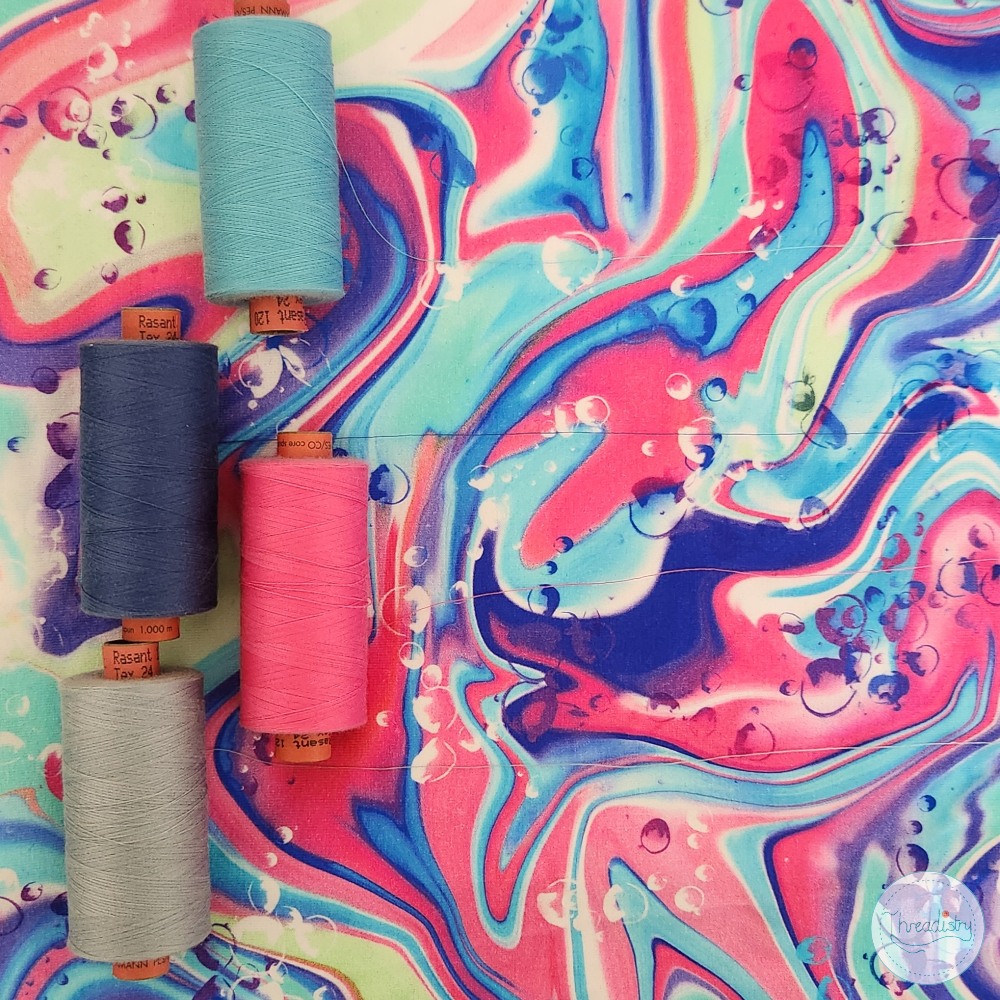
A few specific situations worth knowing:
- Stripes and checks: Match to the color that runs along the seamline. If your seam falls mostly along a navy stripe, use a slightly darker navy. If it cuts across multiple colors equally, default to grey or the dominant background color.
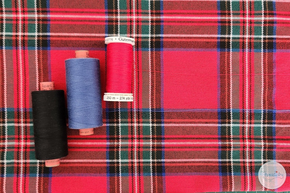
- Prints with a light background: Resist the urge to use white or cream thread just because the background is light. If the print has any depth or color variation, a warm greige or light taupe will disappear far more effectively than a stark white.
- Dark or high-contrast prints: These are the most forgiving. A dark charcoal or near-black thread works across most dark busy prints.
When you don’t have the right color: grey to the rescue
Sometimes you’re sewing you simply don’t have a close match in your thread stash and don’t have time to go shopping. This is where grey earns its place as one of the most useful spools you can own. A medium grey works surprisingly well on a wide range of fabrics, particularly heathered, textured, or mixed-fibre surfaces where the color isn’t fully saturated to begin with.
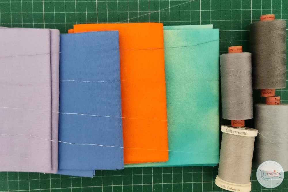
The logic is the same as the darker-shade rule: grey is visually neutral, so it tends to recede rather than stand out. On cool-toned fabrics like navy, slate, or charcoal, a mid grey can be nearly invisible. On warm tones like rust, olive, or brown, a grey with a slightly warm or taupe cast works better than a stark cool grey.
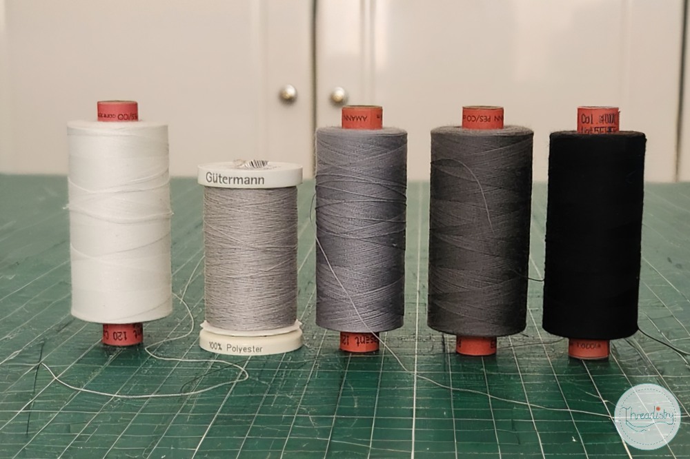
A few things to keep in mind. Grey works best on construction seams that won’t be visible from the outside. For topstitching or any seam that shows, it’s still worth sourcing a proper match. And on very light fabrics like white or pale ivory, grey can read as a shadow, so white or off-white thread is the better choice there.
If you’re building a minimal thread kit for travel sewing or just want a small stash that covers a lot of ground, three greys (light, medium, and dark) plus black and white will get you further than you might think.
When exact matching (or lighter thread) does work
Like most sewing rules, this one has exceptions. If you’re doing decorative topstitching and want it to show, matching, going slightly lighter or boldly contrasting can be a deliberate design choice. Bright stitching on denim, tonal topstitching on a collar: these are moments where you’re using thread as a design element rather than trying to hide it.
But for construction seams, hems, zip insertions, and anywhere else you want clean, invisible stitching? Darker is almost always better.
This is one of those tiny shifts that makes your finished sewing look noticeably more polished. Next time you’re at the fabric shop, put down the exact match and pick up the one that’s just a shade deeper. You might be surprised at the difference.